|
|
|
|||||||||||||
Economist Sala-i-Martin's way of slicing through poverty numbers will make India look different. |
||||||||||||||
|
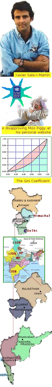
When economist Xavier Sala-i-Martin of Columbia University, USA waded past the gloom and doom chorus and looked at global poverty numbers he found much to cheer. The picture wasn't as grim as the mourners had it. Because of globalisation, poverty had actually fallen and inequality had tended to lessen. His findings are silencing many voices. But why is his work good news for India? As we shall soon see, when India's own poverty numbers are re-evaluated in the light of his work, Indians can rid themselves of a few popular, depressing myths. The whacky professor: Prof. Sala-i-Martin is not yet a celebrity. And if you visited his website, you may not take him seriously. There is Miss.Piggy of the Muppets striking a languid pose and techno duellists from Star Wars. The animated gifs, multi-coloured, winking text and funky audio might make you imagine a delirious teenager. But you'd be unwise to dismiss him lightly. He is a PhD from Harvard and ranks 16th in a list of 1000 economists rated by citations of their work. Sala-i-Martin is probably the Richard Feynman of economics. Like that irreverent but brilliant physicist he has his unserious side that masks an incisive mind. His novel analytical methods are turning conventional wisdom on poverty and inequality on its head. On what basis does a serious voice as Noam Chomsky's assert thus: "With regard to incomes, inequality is soaring through the globalization period within countries and across countries. And that's expected to continue." Sala-i-Martin,traced the assertion to the Human Development Reports [HDR] published by the United Nations Development programme [UNDP]. Since 1990, HDRs have been regularly published and have created a welcome awareness about the need for equity in development. They have very high brand value. In 1999 the HDR intoned thus: "Most obviously, poverty and inequality have grown alongside the expansion of globalization. In a world of disturbing contrasts, the gap between rich and poor countries, and between rich and poor people, continues to widen." Harvard's Lant Pritchett famously dubbed this conclusion, "Divergence, Big Time". Media and opinion makers like Chomsky chimed in and the causerati massed up in their thousands. Sifting the numbers: When Sala-i-Martin pored over poverty numbers, country by country, and studied UNDP's analysis of them he began to see a series of flaws. Current exchange rates were being used instead of purchasing power parity [PPP]. It is PPP that adjusts for the fact that a dollar in Zaire buys a lot more than in the USA. Then for some reason the 'one-1985-dollar' that had been the agreed threshold for determining poverty had mysteriously been raised to $2 and even $4, thus throwing up wild and non-comparable statistics. Elsewhere --in a comparison exercise-- only 19 of the 29 industrialised countries had been cited, thus worsening poverty and inequality figures. But most glaring of all the errors was considering each country as a data point without regard to its population or its unique within-country poverty dynamics. For example all of Africa's 35 countries [where the world's poorest live and progress is slow] do not exceed half the population of China [where poverty is rapidly falling]. Yet China is an equal at count time with the 35. Sala-i-Martin says that you must unbundle countries, pool their population and sort them to create world-wide income groups. Then, people --rid of their country badges-- tell a different story. Sala-i-Martin used seven accepted technical criteria to study the poverty and inequality statistics. Of these the Gini Coefficient is probably the one that is easily understood. Refer to the diagram where units of count [households, cities, states or countries] are set out on the horizontal axis and their incomes on the vertical. In a perfectly 'equal' world, every unit will have the same income. That idealised case when plotted results in the diagonal line. In the real world however, the curve would deviate from the perfect diagonal. This curve --the hammock below the diagonal-- is known as the Lorenz Curve after Max O.Lorenz. Later, Corrodo Gini developed a coefficient to quantify income inequality. This is the pink area between the diagonal and the Lorenz curve divided by the whole area under the diagonal [pink+blue]. So if every country in the world had the same income, pink area would be zero and Gini Coeff would be zero too. That being far from the case, the Gini would always be more than zero-- far off in unequal societies and closer in equitable ones. How far off and how does it trend, should be our concern. Sala-i-Martin's point is that if the unit of count is 'countries' the Gini Coeff would be grimmer than if the count was 'people'. So,he unbundles countries and looks at individuals. He studied the situation of world poverty at two terminal years -- 1970 and 1998-- when post-modern globalisation kicked in. The findings are far from depressing. $2 poverty fell from 44% to 19%. $1 dollar poverty fell from 20% to 5%. Gini Coeff fell from 0.66 to 0.63. Most of this good news is because of China and India opening their doors. In 1970, 11% of the world's poor were in Africa and 76% in Asia. In 1998, Africa had 66% of them and Asia, 15%. Sad though this may seem for Africa, worldwide head-count of the poor has fallen by 400 million people - and falling. Most of the benefit has of course accrued to Asia, largely because of their integration with world trade. The trend is clear: inequality is closing and poverty falling even if the rate is infinitissimal. When people parrot that it is "Divergence, Big Time", Sala-i-Martin retorts that in fact it is "Convergence, Period". A new tool for India: India is home to probably the world's largest collection of poverty poets and doom sayers. Therefore it would be interesting if a few professional economists applied Sala-i-Martin's techniques on India's poverty numbers. If the global scene looks better because India made a major contribution by pulling away from poverty, surely the within country dynamic must be good too. Is anyone slicing through the lumped data and seeing the finer patterns within? An unpopular Sala-i-Martin's assertion is that poverty and inequality are separate issues. Even in societies that are getting better, inequality worsens before it gets better. Nor is it a total evil: it may signal the carrots that await the wealth creator. Inequality may even remain same or rise when poverty is actually falling. Sensibly, societies must tackle poverty and inequality in that order. In March,2001, GoodNewsIndia ran a story on India's poverty that carved the national average of 24% and showed how it varied from state to state. We can cut further slices from the data there and elsewhere. Of India's 300 million poor, 60 million live in 2 states with a poverty level of 50%, 105m in 8 states with 40%; 73m in 5 states with 30%; 54m in 9 states with 20% and 8m in 7 states with less than 10%. Let's study the last category - the less than 10% poverty area. 78 million people [of whom 8 million are poor] live across Haryana, Punjab, Delhi, Himachal and J&K. [Tiny Goa and Daman, also in this <10% category are left out because they are not contiguous.] The total area they cover is approximately 250,000 sq.km. Let's now indulge in a fanciful exercise: quarter million sq.km is about the same as the UK's area and if you took away the 10% poor, the population is about the same too. Of course, there is a huge gap in incomes, but a virtual Success State --comparable to the UK in size and density-- exists in India spread over a fairly cohesive land mass. Also, this virtualUK's growth rate is higher than that of the UK [- so probably 'between-country' income inequality is falling] even if 'within-country' inequality is large in this Indian pocket. Development by stealth: Development and prosperity always propagate by creep. It was only after Western Europe had soaked itself in prosperity that the dye bled across its eastern and southern edges. In our sample, Punjab, Haryana, Delhi, Himachal and J&K are contiguous. It is no surprise therefore, that Gujarat, Rajasthan, UP and MP are contiguous with this core. Not for nothing are Gujarat and Rajasthan, less-than-20%-poverty states. It is fairly intuitive that if MP and UP were sliced, their contact areas with the core would show lower poverty than those states' average. Now that we are launched on the Sala-i-Martin inspired approach of slicing lumped data, let us stay a while longer with it. Look at the map of India alongside. The two yellow <20% islands are separated by Maharashtra. With a poverty level between 20 and 30% this state hovers around the national average of 26.1% But it also so happens that Maharashtra is India's fastest growing state. Therefore, despite being the second most populous state, it's likely to post the swiftest reduction of poverty. In many ways Maharashtra is our own China. When western India is dyed yellow and keeps reducing its poverty, we are led to a new pattern. Because of our media and our poverty pundits, we have taken as a given that there is a north-south divide. It turns out that in fact, it is an east-west divide. And within the western slice, it is the north that has better poverty numbers. How media-programmed we do get! People's economic activity, in a free market like India, does not respect lines on the map drawn between states. The within-country equivalent of globalised trade for India, is the free market. Internally India 'globalises' as and when inter-state trade, taxes, information, communications and markets are reformed and made truly uniform. For a large open continental country like India, free market reforms within, are a greater issue than those of globalisation. The anti-globalisation hysteria is taking our energy away from a hysterical need to devlop a common operating system for the whole country. We need a stable, user-friendly India-OS. GoodNewsIndia is not technically competent to make a definitive statement based on its hunches, but surely new and more positive approaches are needed while poverty statistics are interpreted. Lumped numbers may look delphic but they don't tell the real story. An overly grim mind set is not necessarily scholarly and a zestful approach is not any less rigorous. Professor Xavier Sala-i-Martin may cultivate the image of a prankster today, but you are going to take him seriously pretty soon -- and reevaluate India in the light that he has shed. ___
The Sala-i-Martin technical paper that set off the whole debate is available in PDF format from this page. Click the highlighted title there to begin the download. ___
Image to illustrate Gini Coefficient taken from this link ___
It's only proper that UNDP's rebuttal of Sala-I-Martin's criticism is factored in as well. Here's the link. ___
Prof. Sala-i-Martin takes his web-design seriously. And for all your first impressions, there is much that is serious that he presents with a light touch. In particular don't fail to visit the page on Keynes and his economics. Go to this page and click the link there. This is proof that serious arguments can be won with devastating wit. ___
September,2002 |
Table from an earlier article on poverty in GoodNewsIndia |
|||||||||||||